Tag Archives: diseño

EMOTIONAL CONNECTION, KEY PIECE TO INNOVATE IN THE BTL

Like other industries, BTL marketing has been transformed since its emergence to the present day. A very clear example is what is currently known as marketing 3.0, which, instead of focusing on the product or the target, goes a step further.

 In the industry below the line, the medium is what is evolving, because now, through different actions, an emotional connection with the client is sought. Precisely about this spoke Alejandro Corona, marketing director of Aspel, in his conference “Innovation through emotional connections”, on the second day of the BTL Conference.

One of the first questions mentioned by Alejandro Corona in his presentation was the difference between innovation and creativity: while the second refers to thinking about something new, the second is based on doing it. So the main distinction lies in the implementation of a creative idea.

“Emotions sell” ,said Alejandro Corona in his speech, mentioning that it is through the emotional connection that a brand can directly generate a reaction in the consumer and the shopper.

Emotion, as a pristine psychological factor in human nature, can be divided into four distinct categories: happiness, sadness, anger and worry. These elements work as purchase motives, so both brands and agencies must begin to create materials that connect emotionally.

However, how can information be obtained to generate an emotional connection with the consumer? Alejandro Corona explains that it must be done through research, to know the psyche of the clients and thus be able to obtain the necessary insights to generate campaigns and strategies that generate a powerful impact.

The insights with indispensable” ,said Alejandro Corona, who also said that they are totally necessary to generate campaigns nowadays and that requires, beyond a focus group, an anthropological study.

What strategies work well to connect emotionally with people? Alejandro Corona explains that it can be done through social media; However, he highlighted the relevance of content as “king”, currently in the below the line and in marketing in general.

Source: Alejandro Ramírez – InformaBTL


MEET THE COLORS THAT INCREASE SALES IN BTL CAMPAIGNS

Big brands like Coca Cola or McDonald’s are very well positioned, they also had a long way to go.

People specialized in the world of advertising, know well the primordial colors to achieve success in a campaign. Just as big brands like Coca Cola or McDonald’s are very well positioned, they also had a long way to go.

The color that is between the two mentioned brands is red, which is in first place in the list.

RED: According to several psychology and marketing specialists, the color red shows power. It also gets the attention of people. This is why it is most used in marketing campaigns.

BLUE: Blue is always a good option when a company wants to be trustworthy and fresh. It also provides better results.

YELLOW: This color provides power and illumination. In addition, it also attracts the audience. Represents confidence and increases levels of optimism because it causes the release of serotonin, the hormone of happiness

ROSA: It is the ideal color for a feminine and young company.

GOLD: It is the perfect color for campaigns focused on power and luxury. At BTL it represents prestige, wealth and is associated with high quality products.

GREEN: Represents harmony, restoration, peace and balance. It also means a balance when it comes to campaigns.

ORANGE: It is powerful and attractive. Representing the most commercialized products in a fun and fresh way.

COFFEE: BTL campaigns demonstrate stability and reliability, also suggest sobriety and friendship. It is used to break the barrier between the business and the customers.

PURPLE: It is a dominant color, connotes sophistication and abundance, also represents royalty.

BLACK: This powerful color can represent the modern or traditional, the exciting or relaxed, is used to contrast colors. It also adds drama and suspense.

Source: Mercado Negro


5 TRENDS IN DESIGN THAT HAVE STOOD OUT IN 2018

By introducing a new product in the market, brands use different strategies to communicate to the consumer about their launch and motivate their interest in it. One of them is packaging, which, besides containing and protecting what it contains, keeps a commercial and image function in such a way that it has a striking presentation for the target.

In 2017, 65.9 percent of consumers in Mexico said that being in front of a packaging that is attractive to them, this may be sufficient reason to change their purchasing decision, as indicated by the Research Department of InformaBTL.

The fact that a package and its design have the ability to modify an intention to purchase, responds to how it is perceived by the client and how it reacts at the brain level.

Charles Spence, professor and head of the Intermodal Research Laboratory, part of the Department of Experimental Psychology at the University of Oxford, affirms that the colors, smells and textures of a packaging are key factors, at the moment not only to make the purchase decision, but also when it comes to identifying a brand, hence several packages, wraps, bottles and others have a certain color palette.

In this sense, there are trends in design that, in addition to influencing the perception of the customer to make their purchase decision, have made the packaging allows a brand to stand out on the shelf.

SIMPLICITY

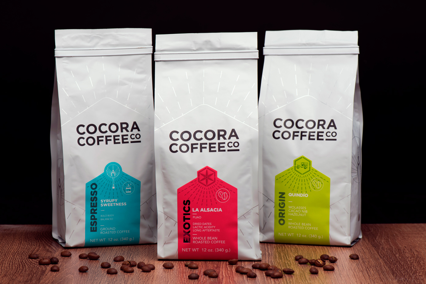
Minimalist designs, with few graphics but that highlight the image of the firm, facilitate a better reading by the shopper, besides looking cleaner and more orderly.

PASTEL COLOURS

This type of colors and tones are aimed at the sensibility of the users, besides being a great option to give the products a warm aura.

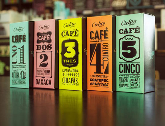
PHRASES WITH LARGE TYPOGRAPHY

A good way to get the attention of the shopper, send a clear message and facilitate the reading and understanding of what you want to communicate, the use of large-scale typography is a trend, which requires a correct choice of typography, as well as of colors and location in the packaging.

STRUCTURES, ILLUSTRATIONS AND VINTAGE DESIGN

This type of packaging, in addition to evoking a fashion and culture, gives the brand and product a strong identity, if it is a launch it strengthens its promotion and awakens in the consumer an emotional connection given the nostalgia it generates.

USE OF HOLOGRAPHIC ELEMENTS

The holographic foil stamping can turn the ordinary into something out of the ordinary, since it is able to add depth, texture and different effects.

Source:  Lizbeth Serrano – InformaBTL


endencia-diseno-publicitario

Template: Excerpt (Defined)

This is the post content. It should be displayed in place of the user-defined excerpt in single-page views.

The Importance of Graphic Design in a Marketing Strategy

A very important aspect of the advertising activity is Graphic Design. We define design as a form of visual communication whose purpose is to structure advertising messages with clear and defined commercial objectives, through the organization and integration of forms, textures and colors that translate into meaningful and relevant communication for their environment, but Especially for the target audience.

In the area of ​​graphic design, the information obtained through marketing, both studies and market research is processed by the creative area, takes shape and comes to life by materializing in a dimensional message and perfectly compatible with the target group, Target to which it is directed.

In this area advertising pieces are created to be printed in various media including brochures, catalogs, manuals, instructions, posters, spectacular advertisements and for public roads, pop (stands), display’s, packaging and packaging materials. In all these executions graphic design also plays an essential role in the creation of the entire structure on which a brand, corporate image or visual identity is built.

Of course graphic design is something much more complex than this, beyond the handling of forms and colors, the designer knows in depth the people, from a Psycho-physiological point of view to understand this way, cognitive, preceptual processes And emotional aspects that operate in the receiver, which will make the difference between a technically correct message and another that penetrates the mind of the receiver and leaves an indelible mark, is therefore undeniable the importance of the participation of graphic design in success when constructing a brand.

Design is fundamental as a communication and marketing tool for both your company and your brand. By investing in design your brand will be perceived positively, translating into differentiation compared to the competition, endowing it with character, loyalty to its customers and achieving an optimal presentation company in front of the market.