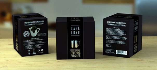
By introducing a new product in the market, brands use different strategies to communicate to the consumer about their launch and motivate their interest in it. One of them is packaging, which, besides containing and protecting what it contains, keeps a commercial and image function in such a way that it has a striking presentation for the target.
In 2017, 65.9 percent of consumers in Mexico said that being in front of a packaging that is attractive to them, this may be sufficient reason to change their purchasing decision, as indicated by the Research Department of InformaBTL.
The fact that a package and its design have the ability to modify an intention to purchase, responds to how it is perceived by the client and how it reacts at the brain level.
Charles Spence, professor and head of the Intermodal Research Laboratory, part of the Department of Experimental Psychology at the University of Oxford, affirms that the colors, smells and textures of a packaging are key factors, at the moment not only to make the purchase decision, but also when it comes to identifying a brand, hence several packages, wraps, bottles and others have a certain color palette.
In this sense, there are trends in design that, in addition to influencing the perception of the customer to make their purchase decision, have made the packaging allows a brand to stand out on the shelf.
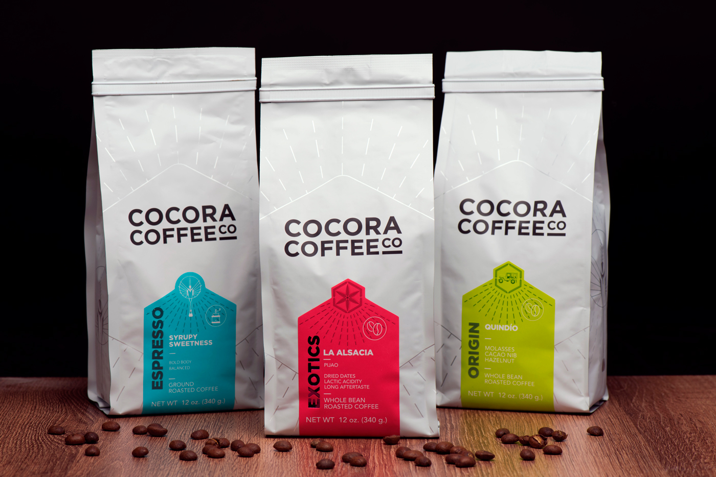
SIMPLICITY
Minimalist designs, with few graphics but that highlight the image of the firm, facilitate a better reading by the shopper, besides looking cleaner and more orderly.
PASTEL COLOURS
This type of colors and tones are aimed at the sensibility of the users, besides being a great option to give the products a warm aura.
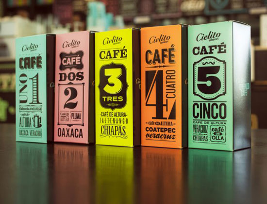
PHRASES WITH LARGE TYPOGRAPHY
A good way to get the attention of the shopper, send a clear message and facilitate the reading and understanding of what you want to communicate, the use of large-scale typography is a trend, which requires a correct choice of typography, as well as of colors and location in the packaging.
STRUCTURES, ILLUSTRATIONS AND VINTAGE DESIGN
This type of packaging, in addition to evoking a fashion and culture, gives the brand and product a strong identity, if it is a launch it strengthens its promotion and awakens in the consumer an emotional connection given the nostalgia it generates.
USE OF HOLOGRAPHIC ELEMENTS
The holographic foil stamping can turn the ordinary into something out of the ordinary, since it is able to add depth, texture and different effects.
Source: Lizbeth Serrano – InformaBTL


 Español